Wij gebruiken cookies op deze website om uw winkelervaring te verbeteren. Wij gebruiken cookies om inloggegevens te onthouden, bieden veilige login, verzamelen statistieken om de sitefunctionaliteit te optimaliseren en leveren inhoud op maat van uw interesses. Klik op Accepteren om toestemming te geven om cookies te accepteren en direct naar de site te gaan of op meer informatie te klikken voor gedetailleerde beschrijvingen van de soorten cookies die we opslaan. Meer informatie
|
Design Studio Guide
TEXT “Add Text” will allow you to add your own text with choice of available fonts. Additionally you can also decorate the text with various effects like font size, bold, italics, font color, alignment w.r.t. design area etc. also when you click on this button will show all the texts in that panel so that you can quickly edit and update it. ART : This Tab will give you choice of available clipart in various categories. Click on any clipart to add it into design area. You can further select and edit clipart properties like size, color, border, alignment w.r.t design area etc. Many Shapes option allows you to draw shapes using free hand pencil tool, line tool, rectangle, and ellipse. Once you have drawn a shape in design area, you can decorate the shape with effects like outline, fill color, size, alignment w.r.t. design area etc. |
||
|
Draw Shapes Back to the top
 Clicking on the “Rectangle” icon opens a sub-menu palette offering the choice among two different options: Rectangle and Square drawing. clicking on these options will draw respective shape on the canvas.  Clicking on the “Ellipse” icon opens a sub-menu palette offering the choice among two different options: Ellipse and Circle drawing. clicking on these options will draw respective shape on the canvas.  Gives option to draw straight line and connect two objects by a line.
 The “pencil tool” allows free hand drawing. The thickness and the color of the strokes could be changed using the “Color Palette” tools. To draw this shapes, position the cursor in the design area and drag to the size of shape required. Once drawn, you can edit object properties like fill color, border style and color settings etc. |
||
|
Editing/Decoration Options Back to the top
Border Stroke Color: This option enables various border color option for selected clipart, shape or text.
Border Stroke Dash Style: Allow option to select various border stroke styles for selected clipart, shape or text.
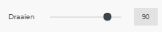
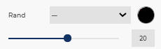
Border Stroke Width: Slider allows you to define the required stroke width for border for selected clipart, shape or text.
 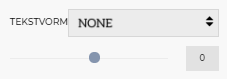
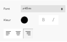
Choose Font: This option will provide you a choice of various predefined font type using drop down menu. Choose the one you like to apply on selected text object. Font Style: Change the font style to Bold or Italic as well as align it left, right or centre within text area. Align will work for multi line text object.
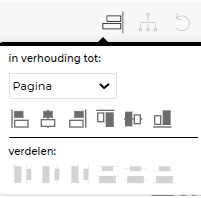
Align Align single object to left, right, centre, top, middle and bottom w.r.t. design area. When a group of objects is selected, you can choose to align all selected objects w.r.t. the smallest object in group, w.r.t. the largest object in group, w.r.t. each other as well as w.r.t. the page area.
Group You can select multiple objects (by dragging your mouse over desired objects or pressing “Shift” key and selecting objects individually) and group them by pressing the group button, which modifies the appearance of the selection. The objects once independent now appears in the group selection like a whole object. Before grouping, every individual object appears bounded by a dashed rectangle but after grouping dashed rectangles disappear and are replaced by a unique dashed line rectangle bounding the whole group. You can now edit all the objects in the group in one go with available editing options. Grouping affects also the “Icon Toolbar” appearance as group button is a toggle button which converts to ungroup button for current selection.
Ungroup This option works on a group of objects. Once ungrouped, each object can be managed and decorated separately.
Delete Object will remove the selected object only.
Delete All Scraps complete design from design area in one click.
Help Opens studio help content.
  |
||
|
Manage Layer Back to the top
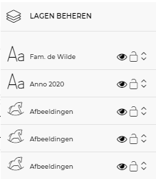 Layer Panel: Layers panel makes it easy to select any object and perform certain operations
|
||
|
Edit Clipart Back to the top
 You can change each single color available in clipart from editing panel. |
||
|
Group Editing Back to the top
 You can select multiple objects by dragging your mouse over desired objects or by pressing “Shift” key and selecting desired objects.
Multiple selected objects are shown with dashed borders. Now you can edit common properties of these objects in one go e.g. color, border settings, position, size etc.
|
||
|
Maximum Print Area Back to the top
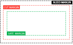 Safe Margin (green dotted line) |
||
|
Add Images Back to the top
 Add image allows the import of JPG, JPEG, PNG images from your local storage or from public image libraries from Picasa, Flickr and Instagram. Select the image upload option and add images to image gallery. Now, you can add any image from image gallery to design area by clicking on it. Now, you can further edit the image properties like size, positoin, rotation etc. |
||
|
Add Background Back to the top
 You can fill the background with any solid color from color palette or apply background image from image gallery offered by store. You can even repeat same background image on all pages of the product in single click, or apply unique background for each page separately |
||
|
Add to Cart Back to the top
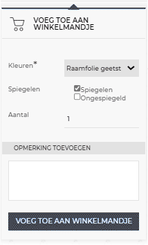 Once your artwork is ready and you are ready to order, click on add to cat to proceed to checkout and pay. |
||
|
Color Pallet Back to the top
 Clicking on the color icon open a dialogue box which allows setting the filling color choosing it in a palette or specifying RGB or HSV coordinates. |
||
|
Shortcuts Back to the top
SHIFT + CLICK CLICK + DRAG SHIFT(while resize) To Select multiple objects To Select multiple objects To resize objects proportionally |
||
|
Image Effect Module Back to the top
 In edit image pop-up, added a new tab for “Effects” using which user can apply image masks in different shapes; zoom in/out images and crop, apply image filters like sepia, black & white etc. |
||
